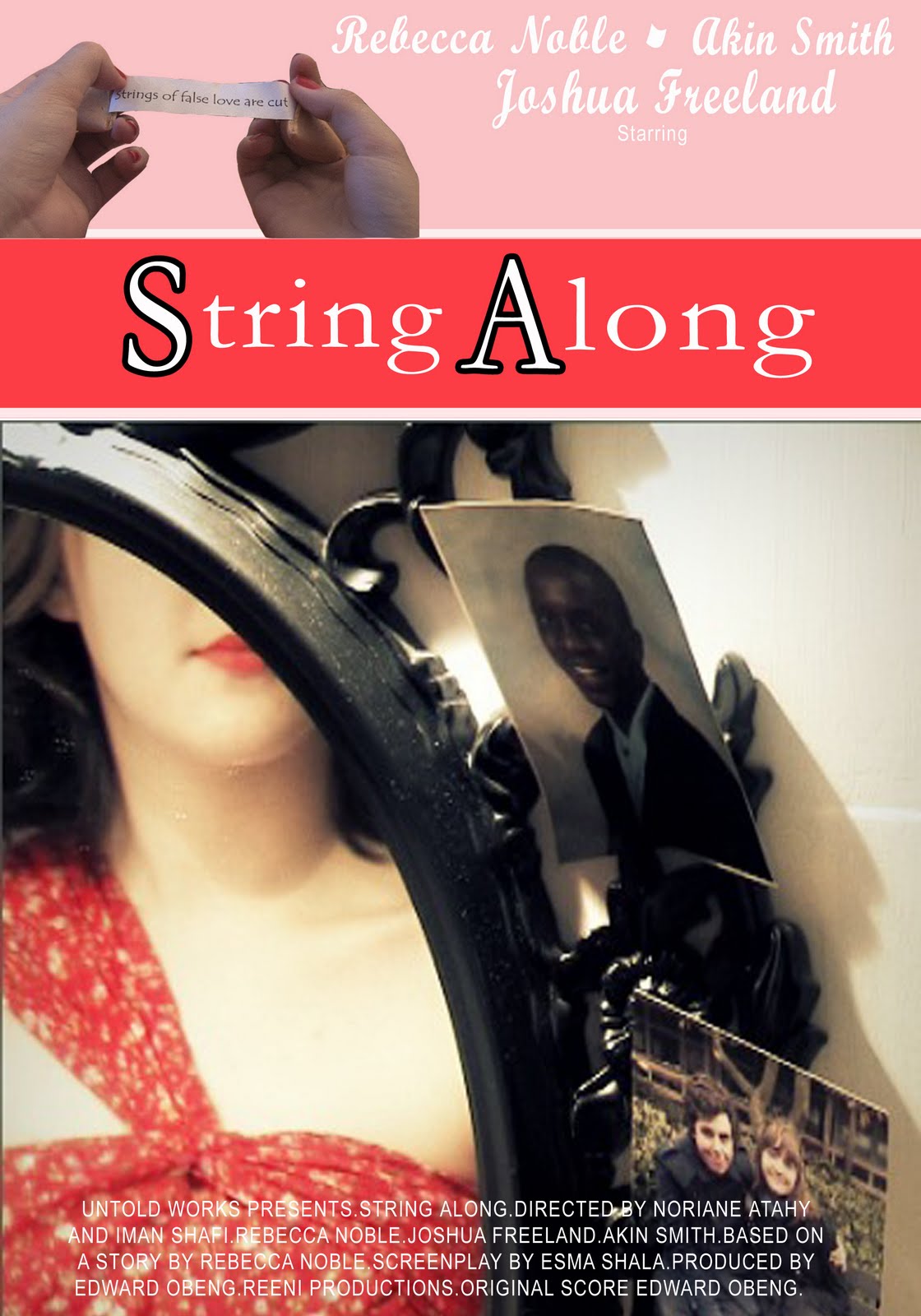
For my last poster in the campaign I've used a poster more suitable for a magazine advert. The layout was based on the 500 Days of Summer poster i researched. I felt for a magazine addition i needed a more contemporary layout, as it would be mostly viewed by our female target audience. There is a matching house style to the others, however it differs as a less vintage inspired poster. The font is all white as i felt the red was too strong on the pink banners. This poster also uses a clearer image in relation to the storyline, as i felt that more mainstream audiences will need a clearer understanding of the films story, as with Delilah in the mirror and the two photo's next to it, it suggests a story of a woman's romance between to men. I also used an image of the fortune as opposed to having the tag line in text. I felt this complimented the post well as it does in the 500 Days poster, with the banners in place using a text tag line would have been to plain.
By Jessica Porter, an audience member :)
ReplyDeleteThis poster is my favourite out of the 3.
The womans' face being hidden has various effects. It can draw the audience in, creating a want in them to know what she looks like; and it can also put forward the idea that the womans' looks are less important than her actions.
The poster is clear and well set out. It is not confusing or distracting, and can easily be understood, that is why this is my favourite. Not that i dont like all of them, i do!!
This comment has been removed by the author.
ReplyDeleteI have to agree with the comment above and say that this is the best by far. It follows all the conventions of your genre and your choice of pictures is on point. It catches the eye and keeps you interested. With this poster you have set a very high standard and I wish that mine were this good! I really can not say anything wrong with it..well done :)
ReplyDelete