String Along

Monday, 13 December 2010

Call Sheet


A contact sheet for our crew and actors while filming, this way we can ensure easy communication between each other.

Saturday, 11 December 2010

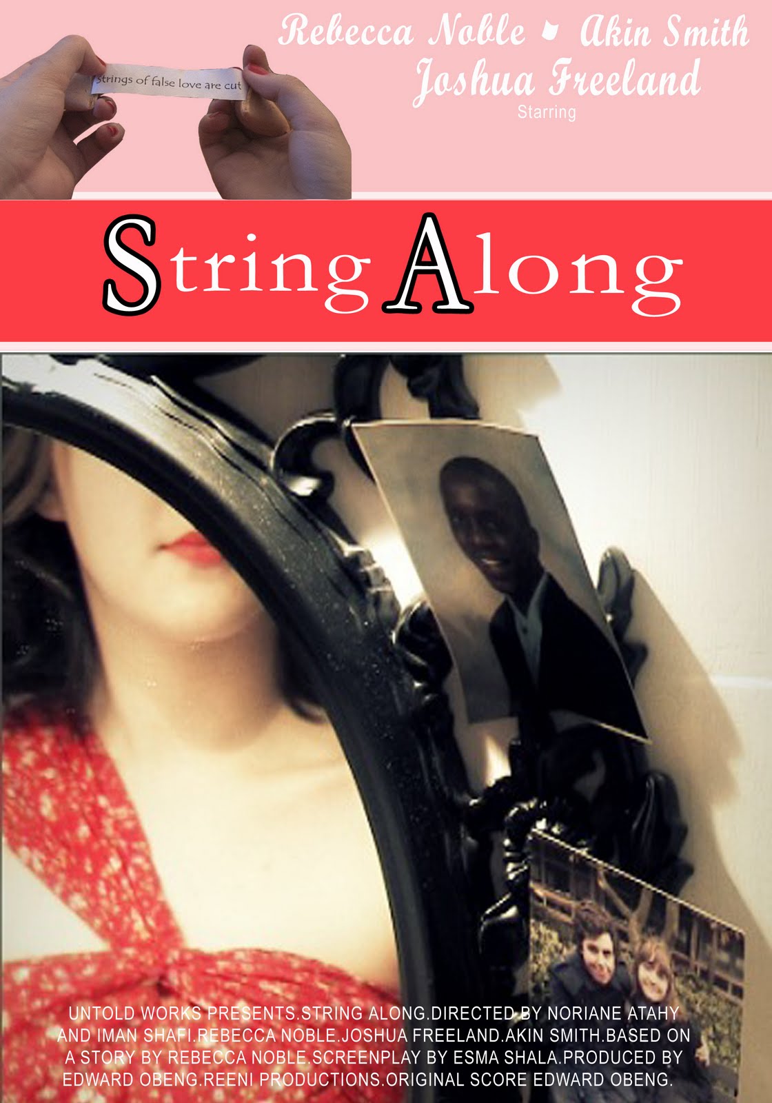
Ancillary Poster 3


For my last poster in the campaign I've used a poster more suitable for a magazine advert. The layout was based on the 500 Days of Summer poster i researched. I felt for a magazine addition i needed a more contemporary layout, as it would be mostly viewed by our female target audience. There is a matching house style to the others, however it differs as a less vintage inspired poster. The font is all white as i felt the red was too strong on the pink banners. This poster also uses a clearer image in relation to the storyline, as i felt that more mainstream audiences will need a clearer understanding of the films story, as with Delilah in the mirror and the two photo's next to it, it suggests a story of a woman's romance between to men. I also used an image of the fortune as opposed to having the tag line in text. I felt this complimented the post well as it does in the 500 Days poster, with the banners in place using a text tag line would have been to plain.

Ancillary Poster 2


For my second poster this is aimed at a billboard or cinema poster layout. It's inspired by a fusion of 500 Days of Summer and The Cat on the Tin Roof. The image i used is from a photo shot of Delilahs character, with a similar pose to that of Elizabeth Taylor and Zooey Deschanel on the other posters, to portray her as the strong, sensual woman. It uses a tag line from the fortune in the film, to still represent the strings of fate, and uses the house style font from before, with an alteration of full bold font. Which i decided to do based on visibility on a billboard.

Wednesday, 8 December 2010

Ancillary Poster 1


As my first poster in the campaign, I've used a image from the abstract world. After looking at poster such as Clockwork Orange, Vaduva Neagra and The Great Gatsby I've attempted to create a mix of there styles to create a poster that both film enthusiasts and women will be attracted to. Although this poster leans toward a more artist one from the use of the image with the red string.However the arrangement and layout was heavily influenced by The Great Gatsby, i felt this way it was more inviting to a female audience as well. I added elements such as the reviews and ratings to further appeal to a film knowledgeable audience, and the tag line is from a draft of our fortunes we created. To further link to the Chinese theme of fate.
I choose the colour scheme based on the prominent colours of our film, and based on the vintage schemes. This give the poster a sense of the drama and romance genres and not creating to much of a dark and mysterious impression.

Thursday, 2 December 2010

Ancillary Reviews ~ Film Magazine Process

These screenshots are the process of creating my review, and how i adapted the layout to resemble Empire magazines reviews, it wasn't difficult recreating Empires house style, although i experimented at first.


We haven't decided on an official name for our film yet, so as a group we've been experimenting with different titles to see what fits to our film. So you may see variations for names throughout my drafts.

Ancillary Reviews ~ Final Film Magazine


Ancillary Reviews ~ Research

Empire Reviews

Empire Magazine is a media magazine that reviews and presents articles about film, games, music, dvds etc.


From looking at Empires review pages, I've analysed a house style and layout which I can recreate for my own film reviews appearance in Empire magazine.

The set and layout involves the 'main feature' which is usually a blockbuster status film, with 3 or 4 smaller film reviews below. With an image for each for easy relation for readers.
The review itself is in-depth, referring to common film knowledge and lingo, while making comparisons to similar films or stories. The language is clearly targeted at film enthusiasts and those with interest in the industry, which is what I'll aim to do in my own review, perhaps by using film terms and expressing an understanding myself through the review.


This type of reviewing style I feel suits our film better, with it being a more visual and representing independent film. Empire review these based on themes, most reviews with the main feature at the top, and the others below are linked by the same or similar genres and themes.