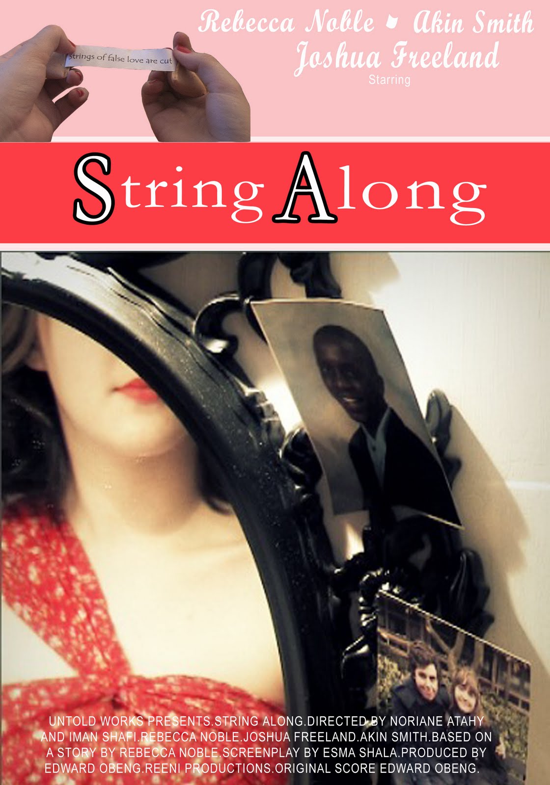
String Along

Tuesday, 18 January 2011

Evaluation 1


Question 1

In what ways does your media product use, develop or challenge forms and conventions of real media
products?


‘String Along’ is a film that’s classed under a drama and romance genre. After creating the story of Delilah, the cheating woman, which was based on the theme of ‘The Fall’ I developed the idea into someone who loses everything by there own fault. Because of this story line, I knew the conventions I needed to successful portray from other films of the same genre and story. Studying films of the same genre I understood the narrative conventions that seemed to follow in most films about affairs or cheating. Getting caught is the continuous plot point in the large majority affair films, which was something I didn’t originally have in the idea for the story.In my first treatments the woman was never caught and her lack of commitment led to her fall. However I changed his plot point after feedback and further research into the genre, feeling we needed an event that would have a larger impact on both the character and the audience. A film we referred to for this idea wasBroken Embraces’ (2009). A Spanish film directed by Pedro Almodóvar, follows the genres of drama, romance and thriller. The main character Lena is caught between two men, one who she loves and one who provides for her. Similar to Delilah, expect her motives for her cheating is out of her greed. Also confrontation s eemed to be an important element to the same genre, films like Unfaithful (2002), were the partner becomes suspicious and the cheater is discovered.


It’s that confrontation that creates the dramatic themes to the film. However we’ve developed this idea further to create a moral message to the audience. We see how our character falls and lose everything because of her decision to cheat, rather than following the idea in Unfaithful, were in the end her marriage continues. With the door being left ajar in our film we’ve followed the idea of being caught red handed, however we had to forebode this happening through silence. Were as in a film like Unfaithful, the lies are discover through different characters dialogue, we had to present to the audience the inevitability of her end by actions. Leaving the door ajar, the use of the dropping thread and the fortune cookie are all to give the audience the clues and foreboding they would get with dialogue.
Our biggest development of the narrative of String Along’ development was the use of the abstract world. By using it we created a thriller like atmosphere, gave a hint of thriller to the genre. Although we leave the abstract world open to audience interpretation, whether it’s a metaphor of Delilah, or a vision of her mind we developed it to portray the power she believes she has, and her struggle to keep it when confronted. I feel this created a stronger emotional understanding of the story.
This reminds me of the recent film Black Swan’ (2010) which also uses the concept of abstract and fantasy like images to show the conflict and working of the main characters mind. This is to add a thriller pace to the drama. By using the abstract world we've tired to create this.
A challenge that our film creates to media products is the interpretation of the ‘red strings of fate’. Were the original folktale is how the string leads us to our soul mates, we challenged this idea by using the red string to portray Delilah’s connection to the men and to give her a puppeteer image over the men.


The use of character in String Along uses many conventions inspired from existing media products. For the use of the two men, James and David we wanted them to be as different characters as possible. I found a common convention in films with similar themes is the woman’s desire for variety, or someone different from her present lover, present an idea of escapism. Such as in unfaithful, we see two men completely different in lifestyle and personality. This is something we tried to recreate. Making James the younger more love struck boyfriend, while David shows a suave lover character. Delilah’s representation herself is stereotypical of a promiscuous woman, our use of the red lipstick was based on the idea of geisha culture, who wore red lipstick to show her role as a geisha as well as to continue our theme of red. Our challenges of common portrayals of characters in drama/romances is our use of fast paced editing and our visual take on a film topic which is usually based on long scenes with dialogue. Also we attempted to make the relationship between characters less sexual with more focus to the emotional drama of cheating.
For sound we challenged the convention suspense music to fit the situation. Instead I used the soundtrack in a cycle affect, as the film draws near the end we see similar shots and scenes to show the comparison between before, and now that she’s alone. Using the mise en scene to show the clean, feminine room before, and the wrecked, messy room after, reflecting her emotions. We see the difference between the beginning and the end. This music cycle emphasizes that. We gained great inspiration from romance films for the mise en scene, films like indecent proposal use warm lighting, typical of the romance genre. Also the links of red and use of Chinese props was to emphasize the themes of the film, similar to romantic films mise en scene, which use colors and hues to create the romantic themes and atmosphere. Our abstract world, although challenging the genre of a typical romance film is inspired by Black Swan, and similar short films like Quietsch. It uses the ideas that are reminiscent of there lighting and arrangement. Overall String Along uses and challenges many conventions of the romance and drama genre, while including elements of thriller.

Evaluation 2

Question 2

How effective is the combination of your main product and ancillary tasks?


A marketing campaign can be vital to our film, and to attract an audience to the media product we created our ancillary tasks, which take the form of our film posters and review. A poster and review are important parts of a campaign. They all share a relationship with each other to entice the audience. The posters are used to raise questions about the film, capturing the audience’s attention. The review then answers some of those questions and then the audience use the film to see the whole picture.
When creating my ancillary tasks it was important I kept to a house style that matched my film, which also communicates the genres to a clear target audience. Which in my case focuses on young women, similar to Delilah’s character age who I found from research into genre’s audience’s are most likely to be drawn to our film. Also the moral of the story applies mostly to this audience. This made my ancillary tasks an effective combination with ‘String Along’.
My posters are a series of three. During there creation I considered the colour scheme, in which I used reds, whites and pinks. This was to emphasise the key genres of the film. From my poster research I saw common conventions it drama and romance films, such as the red bold text I used similar to The Great Gatsby’ and Cat on the Tin Roof and general colour scheme. Although my feedback from my posters was that my more modern poster (poster three) would be more appealing to the audience as because of the others being based on older film poster layouts and colour schemes they matched the current conventions of a romance poster less. On reflection using too many different fonts and the use of the pink made my poster a less effective combination to my film. Although I also feel I effectively portrayed Delilah in the campaign.
By using Delilah’s image in every poster I can convey that she is the main character and of the most importance in the film. I decided against using images of the two men apart from in my third poster to show what they represent to Delilah, by only showing her the audience can establish our film is her story. The use of her posed image in poster two is unlike the typical convention of a romance film poster which uses in various ways a couple image, or represents two main characters. Films such as Casablanca , Australia, Remember me, Dear John and Away We Go are all different forms of a romance and use this convention of a couple image. However from seeing this I believe it was more suitable to the film to only show Delilah’s character, as the boyfriends don’t represent love or affection to her, and the audience can understand the film’s plot is about who Delilah is, and what happens to her, rather than her relationship with the men. Inspired by posters like Clockwork Orange, 500 Days of summer, and Gatsby I wanted to combined the abstract element of the film, with the drama. For this I used images of both Delilah with the strings and posed photos of her in posters one and two. The images I felt created an ominous feeling to the poster. These posters were aimed more for a film enthusiast audience, who I felt would find appeal in our film for the abstract elements. The taglines of the fortunes ‘strings of false love will break andthe price of greed is loneliness’ also highlighted the Chinese based themes in the film. These both fit with the films representation well.
My review is also important to the distribution of my film, it needed to sell my film to my target audience of young women and film enthusiasts. My use of language reflected this as I wrote in a similar tone to my Empire magazine examples, however I used less film ‘lingo’ and references as to be accessible to an average audience too. Building a relationship with my audience and the film. My review can also help me advertise to the industry as well, but highlight it as an independent film, suggesting its strengths and weaknesses as a product and helping the film maker become known in the industry. As a whole my ancillary tasks and review needed to be presented as a brand image. By using a house style throughout and presenting the themes of the film to both the industry and my target audience, my campaign has a highly effective combination with the main product, my only weakness was using elements of an older poster in my own series.

Wednesday, 12 January 2011

Evaluation 3

Question 3

What have you learned from your audience feedback?


Feedback has always been important part of film process, it allows us as film creators to understand what our audiences expect, want and perceive in our film. In ‘String Along’ the audience expectations of the genre and visual attention fits to the dramatic and romance genre, something I feel we met and carried on further with our use of abstract scenes. Feedback at preproduction helped us to learn these expectations and had a large influence on shaping our story and film planning. In our early stages we had initial ideas of stories based on serious topics such as drug abuse when based our ideas on a ‘The Fall’.

From this our first feedback was we needed a story ‘less gloomy’ while retaining our moral to the story, it needed to be lighter hearted for our audience. Considering this as a group we created the idea of quote collecting, were we all decided to find quotes or stories that reminded us of the fall, and we brainstormed from there. One of the quotes I brought forward was from a song ‘I don’t wanna fall, I don’t wanna fly I don’t wanna be dangled over the edge of a dying romance’. Although still a sad subject we looked further into the idea of a ‘dying romance’ and felt we found a balance of a serious message and a brighter story in our two initial treatments. We felt the sentiment of these words can apply to any love between any two things coming to an end. A cheating woman and the loss of trust between a man and pet were our final ideas. Liking both stories we used group assessment to decide on pitch and after realising the issue we may face in using a animal for our film, such as the difficulty in planning what the pet will do and controlling them. Also our time limit to film would restrain us being able to use the pet when they were comfortable and created a risk of us not filming the shots we wanted. Even finding ways to represent it was something we felt we wouldn’t be able to do well and focused on the Cheating woman idea.

Looking back on our first treatments our feedback from our teacher and peers steered our story in a very different direction. We were advised that our character Delilah needed to be caught as a key plot point in the story, and that the message of the story wasn’t clear by her cheating but not facing the consequences for it. Our prospect audience felt ‘there’s no closure if she doesn’t get found out’ and ‘It losses the lesson of the story, that cheatings bad’. With further development into our presentation of the film and story we created our final treatment and gained positive feedback about our now stronger storyline, visual ideas and story pace. Such as our vision of the abstract world representing Delilah’s relationships and how we match the beginning scene to the end scene, but show her loss. We were told this was a good idea to give closure to the film.

From our script feedback I learned the need to use clues and foreboding techniques throughout the film to communicate with our audience, before we had a story in place but the storytelling was ‘blander’ than it could be we needed focus on small visual clues that could help show our narrative to the audience. From this we developed ideas such as the thread being pulled from the dress and the fortune cookie prediction which was similar to our storyboard feedback, that when we experimented more with our shot planning and Mise en scene arrangements it made the film much more appealing by sticking to themes of red, romantic props such as flowers and setting the mood of a drama and romance film. Also the example of our series of shots using the wardrobe was something we created after learning our original shots was ‘too static’.

The post production stage was a vital part in hearing various feedback at different stages while editing our film, allowing us to adapt it to suit the audience. In our films construction we asked media peers and other students there opinion of the film to gain wider criticism. Our original feedback was to firstly shorten or cut down the size of shots that were too long or unnecessary, we learnt this as an important factor of a silent film, that most shots should aim to be ‘too the point’. After cutting down on our rushes and organising our timeline our feedback was mostly positive with 2 main suggests or needs for improvement. Firstly we had feedback from many viewers that the music pieces didn’t flow very well. From this we reviewed our music choices and researched a different piece of music for the beginning scene, we felt the original fast beat to the beginning music didn’t fit the pace of the rest of the film. We found viewers agreed that the new music we used fitted the pace and the genre of the film much better. Also the transition between music pieces needed improvement being blunt’ and ‘sudden. To rectify this we had the idea of sectioning the long music piece into smaller pieces and changing volume levels to create a gradual fade out of the music into the next piece. In addition we have the idea of using the music in a cycle effect, to fit with the story and pace of the film, how it begins and ends in the same way. We supported this with the soundtrack and found using the music in this pattern suited the story and helped to create the foreboding atmosphere of something bad which we wanted our audience to feel from the start.

The second piece of feedback we learnt from was our opening scenes and their pace. We were told our beginning pace would do better to match that at the end. The shots of Delilah removing her makeup and fallen in the string was praised the most out of the film as the editing pace and cuts were ‘effective and suited well in switching between the two worlds of abstract and reality’. Initially we were sceptical as to whether we agreed with this and if we knew hope to repeat the same pace at the beginning of the film. However we tried to do so immediately, using shots of the abstract world we had throughout the film and cutting them in a similar style to the ending. We then used these shots together as an introduction to the film and found it worked much better for the audience and to our idea of the opening music being repeat at the ending to create the cycle effect. This feedback I feel was the most altering to our film, but also the best as it created something far better and closer to what we wanted to achieve in our film.

The Ancillary task was more interactive when using feedback as we had the opptuninty to receive comments on the blog for both our review and posters. My posters were based on research into different poster art and posters of my desired genre. I attempted to create poster similar to both an older, more classic design, to fit to the idea of old silent films, and a Morden design to appeal to mainstream audiences. My feedback however was a mix of praise and constructive criticism, and I also learned the difference of taste and opinion of people within the same target audience. For example poster 1 seems to appeal to me the most’ for a member of my film group.


I was praised on the use of main title font and positioning of ratings and image on the page. However my main negative feedback was ‘the fonts work but there should not be too many different fonts as it confuses the look and subverts the professional look, the suaveness, looks a bit indecisive as their are a confusion of fonts, same thing in ancillary 3 where 3 different fonts are used and ancillary 2 where 3-4 different fonts are used too.’ This is something I also agreed with on reflection, and would stick to a main housestyle of font if re-editied. Again in poster two my only criticism was the use of font not suiting my film, which came from another media student. These both being based on a older styling of film posters were most popular with my media peers apart from the font suggestion. Although I found when asking someone classed under our target audience of younger women my 3
rd poster was most successful in advertising to her. 'This poster is my favourite out of the 3.The woman’s' face being hidden has various effects. It can draw the audience in, creating a want in them to know what she looks like; and it can also put forward the idea that the woman’s' looks are less important than her actions.
The poster is clear and well set out. It is not confusing or distracting, and can easily be understood, that is why this is my favourite.’ This showed that my more contemporary poster will be more appealing to our audiences and if I was to re-edit my posters, I know I would create the series to suit this more.


My review feedback was mostly positive, with little suggestion of change. Again asking both media students and a member of the audience I was told ‘You have really kept to the conventions of the empire magazine, making it believable and easy on the eye. The use of language is of a really high level and at points you forget that your reading a review and feel more like your having a conversation’. This was a convention of Empires reviews I wanted to achieve. The audience review was similar, ‘I love the overall message you get from the film, its something that i feel many people could relate to and perhaps learn from. At times the sentences seemed long winded, but it never confused or made me unable to read it’. This was the most important to know that a average member of the public found the style of the review appealing. However my language was also criticized as ‘a bit of a tongue twister and confused me’ and also ‘you have praised it showing that you like it but there must be something bad about it’. This is something I would change if redrafted, realising that the language may not be accessible to a wide audience, and that I lacked clear points that review both the good and bad elements to my film.

Monday, 10 January 2011

Evaluation 4

Question 4


How did you use new media technologies in the construction and research, planning and evaluation stages?


Through the whole process of creating our film we used various technologies to help develop and achieve our aims in creating our final media products. First of all the blog itself was the first technology we were introduced to, researching into other blogs and the use of blog widgets I created a space to present my work that’s easy to access and I’ve found the style of my blogging has developed throughout my film making process. For my research and planning I found it effective at organizing and presenting what I had done and allowed me to experiment with showing my work and findings. Especially the use of videos, images and audio clips in my research, they played a big part in presenting my inspirations behind ideas and examples of techniques that made a large impact on the development of our film.
The use of comments and posting on my blog had also been a good use of gaining and showing feedback from the audience about my blogging, film and ancillary tasks. I found there were few limits as to how I could present my work on my blog and enjoyed the freedom it brings to research tasks and pitching.

This is linked to my use of the internet as a technology. The internet arguably played the biggest part in research planning and construction stages, by given a wide knowledge of themes, stories, filming techniques, filming styles and helping me to show my work in various ways, such as my use of Kizoa image slideshows and Muzicon audio widgets. (http://www.kizoa.com/ http://muzicons.com/ ) internet is a mass media that’s played a large role in my participation in all stages. The internet was also were we obtained our music from London grid, a copyright free music site ( www.lgfl.net/pages/index.aspx ) . This allowed us to explore many different types of music which was suitable for use in our film.

Our use of camera when filming ranges from the use of a canon still camera and the canon XHA1. The still cameras were a useful technology in our research stage in which we carried out our cinematography tasks, I found I learned a lot of how to present visually with it being the focus of our silent film. Also used in the photo storyboard and log while filming it gave us an idea of how our shots are planned and will look in our final product, we also chose to log our filming days to show the filming process and what we did to create your Mise en scene and sets. The Canon XHA1 was our camera used to film and we practiced with the model before our filming days. Developing from AS with our basic use of panning and tracking movements we aimed to use the camera more creatively in our A2 production. The camera was easy to use when we experimented with using action, reaction shots and lower angles, it allowed us to take steady shots from otherwise difficult positions. We were surprised at the success of this use while filming. The images we had from both cameras were also used in the ancillary tasks at a later date, which we found very useful in creating professional posters and a review.


Adobe Premier Pro
was the editing software we used and after researched into styling we wanted we found we were very limited as to what we could do. We originally wanted the use a filter or hue to replicate a black, white and red coloring style such as in films like Sin City. However we found his wasn’t available to use and also had issues with the use of an ‘Echo’ effect in the daydream, as it effect other parts of the film, causing them to turn black which was something we unfortunately could only solve by removing the effect. Although the use of transitions such as cross fades, dip to whites were used effectively and now at A2 level I felt far more confident in editing music into our film and using tools to change volume levels to create transitions between music. For example you’ll notice meeting visual transitions of scenes the music falls quieter and fades out smoothly and then into the next piece.


Photoshop
was one of the last technologies I used to create my media products, using knowledge I gained from online tutorials I was able to use the program well and created my review and poster using screen grabs and images from both the film and photo shoots I carried out with the cast. The software allowed me to edit the colourings and sharpen the picture, which gave the poster a much more professional look, tools such as hue and saturation, focused on the reds allowed me to do this. In addition the use of the magic wand tool enabled me to use my actor images against a clean background, creating a poster I felt gave a more movie poster style to it, as well as it fitting to conventions I found in my research.
Overall technologies were a big influence on how I’ve developed and created my products, and I’ve used a wide range to create my work and present it virally.

Monday, 13 December 2010

Quietsch


This film from future shorts shares similar concepts and ideas i've considered in my treatment. The beginning with the ring leader resembles my vision of the woman in her abstract world, a black empty space where she is the focus. The use of spilt screens is also something i've considered, and the way the childrens movements become synced in parts is how i imagined my date screen to be, with the different men all doing similar actions with the woman. This has been a good reference to help me understand how i can create and organise my vision for the film.

Shooting Schedule


Chinese concept ~ The Red String of Fate

The Red String of Fate is a popular myth in both Chinese and Japanese culture.

Its the idea that theres an invisible 'Red String' which is tyed to our little fingers or ankles, which connect us to our soulmates.

The Folklore for the Chienese concept, where it is most likely to have originated is...

'The story involves a young boy. Walking home one night, a young boy sees an old man standing beneath the moonlight. The man explains to the boy that he is attached to his destined wife by a red thread. He shows the boy the young girl who is destined to be his wife. Being young and having no interest in having a wife, the young boy picks up a rock and throws it at the girl, running away. Many years later, when the boy has grown into a young man, his parents arrange a wedding for him. On the night of his wedding, his wife waits for him in their bedroom, with the traditional veil covering her face. Raising it, the man is delighted to find that his wife is one of the great beauties of his village. However, she wears an adornment on her eyebrow. He asks her why she wears it and she responds that when she was a young girl, a boy threw a rock at her that struck her, leaving a scar on her eyebrow. She self consciously wears the adornment to cover it up. The woman is, in fact, the same young girl connected to the man by the red thread shown to him by the old man back in his childhood'.

'http://en.wikipedia.org/wiki/Red_string_of_fate'

This idea has been re-represented in many ways through both Chinese and Japanese media, along with popular culture all over the world.

Red String of Fate

For the idea of my first Treatment which i presented to the group, I've looked further into my idea of the red strings of fate to show the woman's connection the the men she's cheating on.

This video uses the idea of how the string works, and plays heavily on the 'fate' idea, as he saves the girl from the truck. This could be in interesting concept to include in my story, as we can use the idea of foreboding that the strings show her fate, rather than connection.


This video is another representation to the red string of fate, and how two people follow theirs together, but when they reach the end they're not fated to each other, but decide they would rather ignore the string, and stay together. I liked this take on the idea as it showed that the strings arent set, and dont have to be followed. Perhaps sometimes a perfect relationship isnt a relationship at all, and i'd like the maybe experiment with this idea by showing how the men choose to ignore the strings to the woman.Leaving her.


I had more inspiration from an episode of animated series i watched called XXX Holic, in this episode a woman with many boyfriends begins to feel ill from the lies she tells. By making a pinky promise and lying she slowly becomes so tangled in the strings of fate she cant move her little finger.This idea has had the most impact on my story, it's where my idea sprouted from, as i remebered the story from watching it some time ago.


Black Swan


The Black swan has been released at various film festivals over the world and had great success. By Director Darren Aronofsky it's a close idea to what we want in our film. It has thriller elements to the story through the fantasy visions.
It uses themes of rivalry, romance, ambition and psychological thriller. Because of our abstract world it would be interesting to analyse this to understand what we can achieve. There are scenes in the film, which involves the manipulation of mirrors and gives my the sense of an always hidden agenda, hidden side to her personality. Similar themes to our film.

Note on a Scandal


Notes on a Scandal was released in 2007, by Director Richard Eyre. Its the story of an affair between a young art teacher, and her 15 year old student. Which is discovered by an older teacher who has befriended her. The scandal is then used to for the older teacher to control and have power over the younger. Again these show similar themes of betrayal, drama and thriller aspects. An ominous feeling we want to give our audience when watching Delilahs fall.

Unfaithful


Directed by Adrian Lyne, the drama is a key aspect to this film. Its very strong throughout the film and where the film lacks a moral teaching, the drama keeps it fast paced and enthralling. This idea of the fast paced, quick cut story appeals to our story because of the themes. We see her play between the two men, and although her motives are different we see how she slowly becomes discovered.

The Cheating Woman


When researching to develop a better understanding of Delilah's motives for cheating, i came across some interesting perspectives and ideas from peoples experiences. It can be a delicate subject and there are many stories behind a cheater. From this i hope to understand what Delilah wants from cheating.

'Forbidden fruit seems so much sweeter'.

This statement really stood out to me, to consider a motive as just the temptation to do what were not supposed to? Which lets be honest is a very human urge.

(http://www.helium.com/items/642382-why-women-cheat-on-their-partners)

This article talks about two different women who have cheated, both stories express there ideas why they cheated. However the ideas of neglect and a breaking down relationship just dont fit to Delilah, and her confident personality. However the first line stood out to me.

"Why I Cheated" — Women Fess Up

http://lifestyle.msn.com/relationships/articlematch.aspx?cp-documentid=8424972

In this article, women give there personal reasons and ideas as to why they cheat. It suggests some interesting concepts from lack of passion, long distance to lack of things in common, While these are all realistic reasons for a cheating woman, i personally feel its just not Delilah.

Even from my better understand of personal cheating experiences i still feel Delilah's main motive for cheating is her pure need for attention and power. As a believable person she craves male attention, and enjoys her power over men. Which she then uses to her full advantage. I think its nescessary to show this sinister side of her to fit with our idea of the Abstract world. Also i feel by doing this we'll have a bigger impact on our audience when she's left alone. We can understand her sadness more because she's lost the attention she feeds on.

Call Sheet


A contact sheet for our crew and actors while filming, this way we can ensure easy communication between each other.

Saturday, 11 December 2010

Ancillary Poster 3


For my last poster in the campaign I've used a poster more suitable for a magazine advert. The layout was based on the 500 Days of Summer poster i researched. I felt for a magazine addition i needed a more contemporary layout, as it would be mostly viewed by our female target audience. There is a matching house style to the others, however it differs as a less vintage inspired poster. The font is all white as i felt the red was too strong on the pink banners. This poster also uses a clearer image in relation to the storyline, as i felt that more mainstream audiences will need a clearer understanding of the films story, as with Delilah in the mirror and the two photo's next to it, it suggests a story of a woman's romance between to men. I also used an image of the fortune as opposed to having the tag line in text. I felt this complimented the post well as it does in the 500 Days poster, with the banners in place using a text tag line would have been to plain.

Ancillary Poster 2


For my second poster this is aimed at a billboard or cinema poster layout. It's inspired by a fusion of 500 Days of Summer and The Cat on the Tin Roof. The image i used is from a photo shot of Delilahs character, with a similar pose to that of Elizabeth Taylor and Zooey Deschanel on the other posters, to portray her as the strong, sensual woman. It uses a tag line from the fortune in the film, to still represent the strings of fate, and uses the house style font from before, with an alteration of full bold font. Which i decided to do based on visibility on a billboard.

Wednesday, 8 December 2010

Ancillary Poster 1


As my first poster in the campaign, I've used a image from the abstract world. After looking at poster such as Clockwork Orange, Vaduva Neagra and The Great Gatsby I've attempted to create a mix of there styles to create a poster that both film enthusiasts and women will be attracted to. Although this poster leans toward a more artist one from the use of the image with the red string.However the arrangement and layout was heavily influenced by The Great Gatsby, i felt this way it was more inviting to a female audience as well. I added elements such as the reviews and ratings to further appeal to a film knowledgeable audience, and the tag line is from a draft of our fortunes we created. To further link to the Chinese theme of fate.
I choose the colour scheme based on the prominent colours of our film, and based on the vintage schemes. This give the poster a sense of the drama and romance genres and not creating to much of a dark and mysterious impression.

Thursday, 2 December 2010

Ancillary Reviews ~ Film Magazine Process

These screenshots are the process of creating my review, and how i adapted the layout to resemble Empire magazines reviews, it wasn't difficult recreating Empires house style, although i experimented at first.


We haven't decided on an official name for our film yet, so as a group we've been experimenting with different titles to see what fits to our film. So you may see variations for names throughout my drafts.

Ancillary Reviews ~ Final Film Magazine


Ancillary Reviews ~ Research

Empire Reviews

Empire Magazine is a media magazine that reviews and presents articles about film, games, music, dvds etc.


From looking at Empires review pages, I've analysed a house style and layout which I can recreate for my own film reviews appearance in Empire magazine.

The set and layout involves the 'main feature' which is usually a blockbuster status film, with 3 or 4 smaller film reviews below. With an image for each for easy relation for readers.
The review itself is in-depth, referring to common film knowledge and lingo, while making comparisons to similar films or stories. The language is clearly targeted at film enthusiasts and those with interest in the industry, which is what I'll aim to do in my own review, perhaps by using film terms and expressing an understanding myself through the review.


This type of reviewing style I feel suits our film better, with it being a more visual and representing independent film. Empire review these based on themes, most reviews with the main feature at the top, and the others below are linked by the same or similar genres and themes.

Tuesday, 23 November 2010

Ancillary Poster Research

For our first Ancillary task we're creating 3 posters as part of our films campaign. Researching for poster art, I'm gathering ideas of how i can present my posters, and the conventions of different poster types.

My first look into poster styles is based on a vintage look, i felt for a silent film perhaps a more classic style can act as a homage to early cinema.I've looked at mostly drama or book based films, with some more abstract and creative film genres. This way i can experiment with showing the two sides of my film.


Clockwork Orange is a classic film, with the wacky and disturbing world in it. This poster uses a very creative way of presenting the themes of 'abstract'. It has a clean, white backdrop, with the main image drawing all the attention, the font and arrangement are both very iconic, looking at this example, i can pay close attention to my own use of arrangement to make my poster image unforgettable.


This poster, of a foreign film 'vaduva neagra' has a very stand out design. The image of the lips with the spider legs suggest a woman who is not all she seems to be, an idea that can be used in poster. Its an interesting way of depicting a drama genre with possible thriller. These two posters however more aimed at a film enthusiast audience as they focus more on the art than advertising the film. I would like to include one poster with a more vintage, artist style in the campaign, to be aimed at a film enthusiast audience.


Cat on the tin roof, another vintage film, does well to establish the main character, with hints at the story. One of my main objectives is to portray the power of the woman (Delilah) in the campaign, which we see used in this poster, with Elizabeth Taylor's character seen as a powerful, sensual woman. I've also noticed a pattern or convention in vintage posters based on drama and romance genre's. The font is usually bold, with a red and black outline style. This design would also easily suit my film, and i may use it.


The Great Gatsby! one of my favourite novels and film adaptations.Once again a film poster which suggests drama and romantic themes in the story. The use of the couple in a dramatic pose hint at the scandal to come. This also uses the red and black font as with Cat on the tin roof, and this poster is my favourite out of my research, its clear to the genre, but also leaves mystery into the story.


The details of director, production company etc. are in a subtle arrangement, so the main focus is on the images, but its still included. This is something i would like to re create in my poster. Also despite being a vintage poster, this is open to and will easily attract a female target audience because of the strong themes. This helps me in developing a poster which will both appeal to film enthusiasts and young women, who are most likely to enjoy our film.


For a more comtempary poster i've researched into 500 Days Of Summer, a film that has been a big inspiration to our film, and has had great sucess at both film festivals and in the cinema.This poster focuses on summer, just how i want to focus on Delilah and uses a strong poster layout for the target audience. This is a good reference for me when doing a poster for cinemas and magazines.